Modal
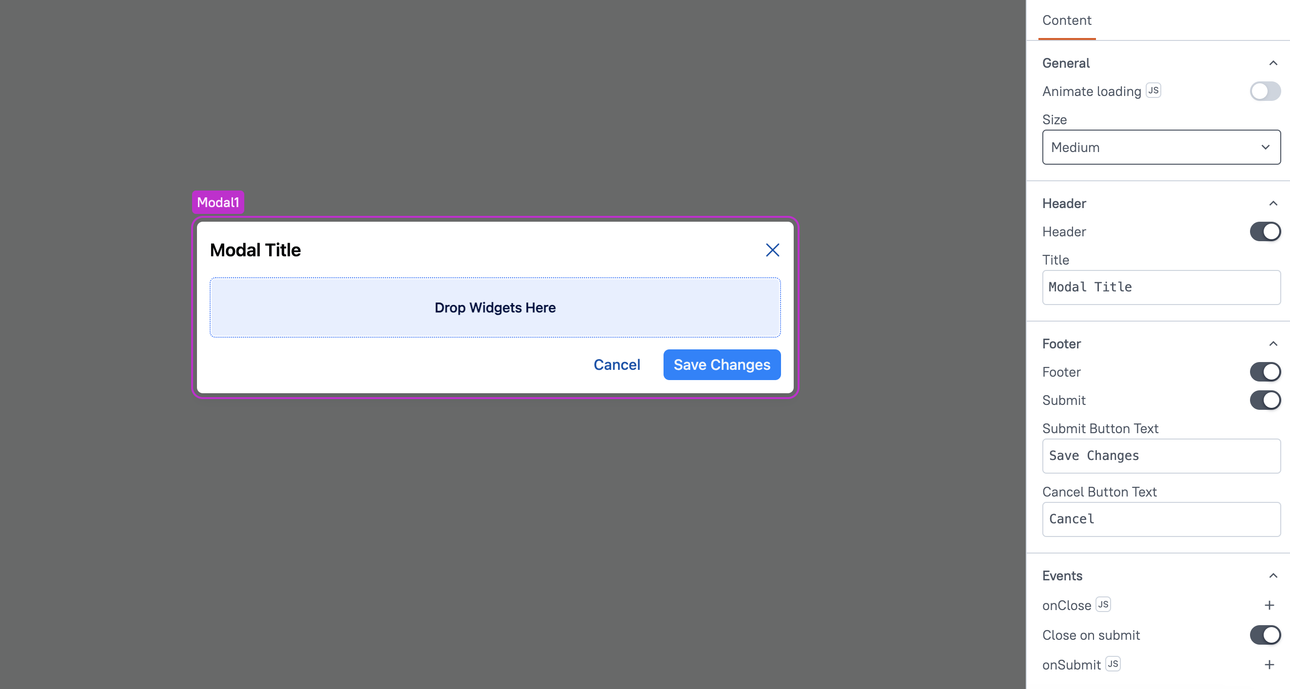
This page provides information on using the Modal widget to create a dialog in your app for displaying various types of content, such as alerts, confirmation pop-ups, forms, and more.

Content properties
These properties are customizable options present in the property pane of the widget, allowing users to modify the widget according to their preferences.
General
Animate Loading boolean
This property controls whether the widget is displayed with a loading animation. When enabled, the widget shows a skeletal animation during the loading process. Additionally, you can control it through JavaScript by clicking on the JS next to the property.
Size string
The Size property determines the overall dimensions of the Modal. You can choose from the following options:
- Small
- Medium
- Large
Header
Header boolean
When enabled, it displays the Title property, allowing you to add a title to the modal. When disabled, the header, including the title, is hidden.
Title string
Sets the title for the Modal. This property is only available when the Header property is enabled.
Footer
Footer boolean
When enabled, it displays the Title property, allowing you to add a title to the modal. When disabled, the header, including the title, is hidden.